Cloud is a complicated topic, and so are all the services and products in this field. At Mlytics, we’re always working hard to make the latest and greatest cloud technologies that were once only available to the big enterprises accessible to mid/small scale companies without a big enterprise-level price tag.
Our team consists of a group of cloud industry veterans that very much understand what are the trending demands, and traditionally how a cloud-related product should be like. So when we were building our platform, we started out from a very technical fashion without thinking about how an average Joe would be using the platform. We didn’t have much problem because most of our users are seasoned IT experts with solid domain knowledge.
We then noticed that there are far more opportunities on the market than we’ve initially anticipated. Many mid/small size companies have been asking about the services which Mlytics platform provides, but most of those companies don’t have a team or even a dedicated IT person to handle related tasks, thus making it difficult to use the platform.
We went back to the drawing board and asked ourselves: how to make our platform become a truly self-service platform?
Where to even begin?
It’s difficult for us to even conduct any research initially because a SaaS cloud product with great UI/UX doesn’t exist. As mentioned earlier: cloud products are complicated, it’s challenging to balance great UI/UX with complex functionality. A good example would be trying to simplify all the buttons and switches on the central command panel of a spacecraft – it is extremely challenging.
We decided to look beyond just cloud products and started looking into some of the best SaaS platforms on the market that have great UI/UX but with complex functionality. We learned a lot.
Power-Ups marketplace
After many hours of researching and brainstorming, we became really ambitious in revamping the platform. But before going too deep, we want to address an issue that has been there since the beginning. There has not been an easy way for users to add/remove options such as CDNs and DDoS protection to/from their site on the Mlytics platform.
Sure, we can add drop-down menus or checkboxes to the platform, but remember the spacecraft button and switches analogy?
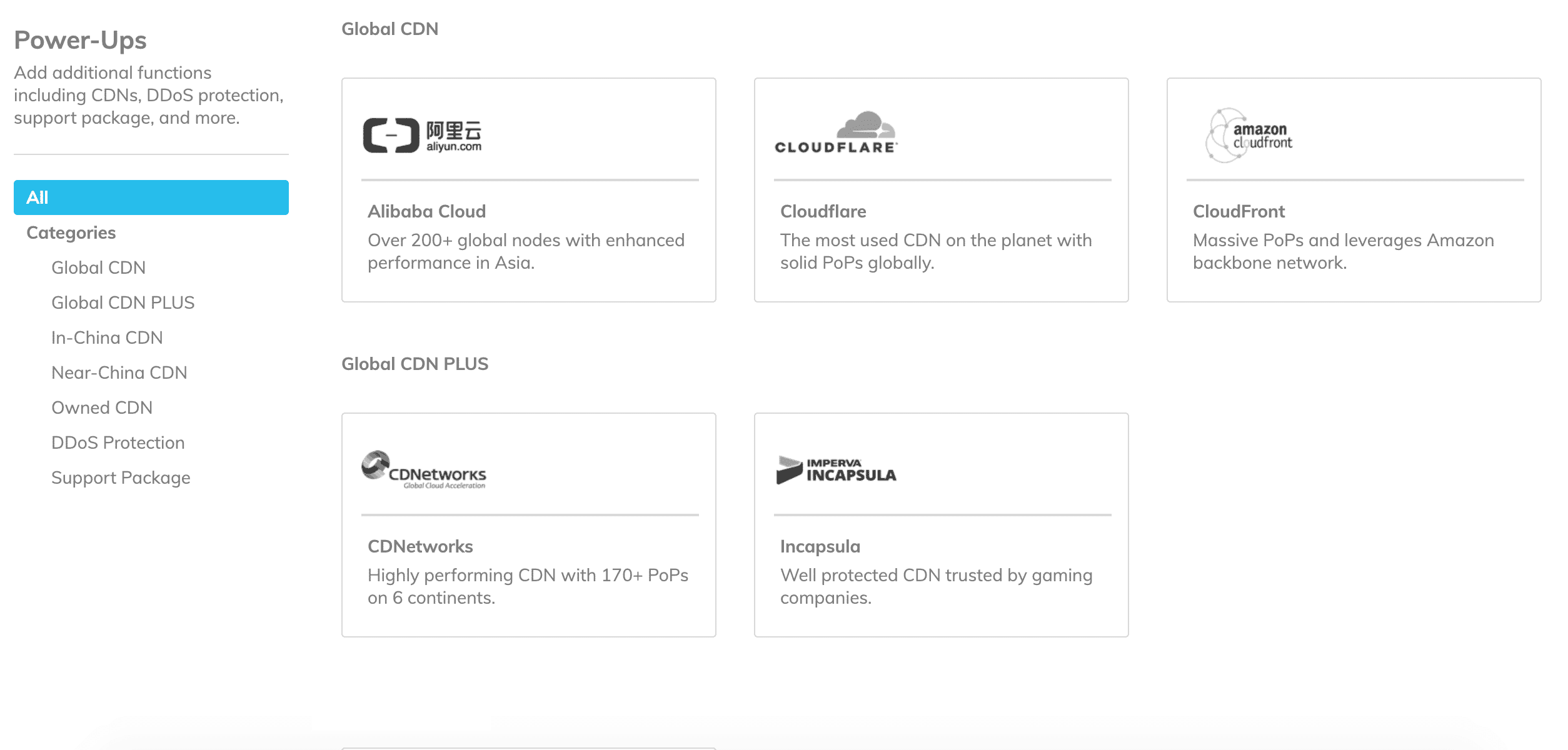
During one brainstorm meeting, I thought it’ll be really cool to simplify everything and package all the optional CDNs, DDoS, and other additional features as Lego pieces so that they can customize freely based on their requirements. I call these Lego pieces “Power-Ups”.

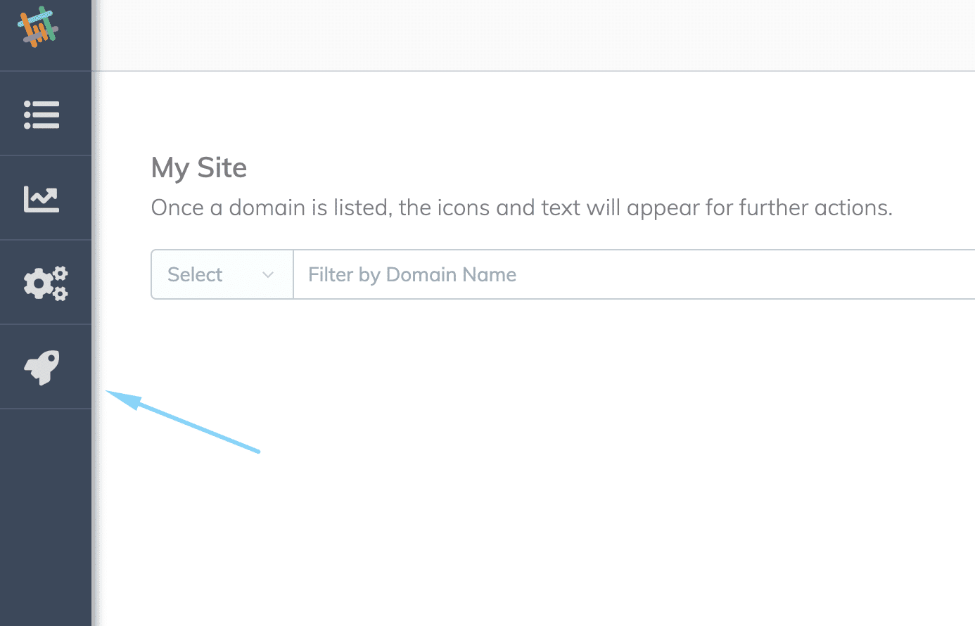
So where can they get these “Power-Ups”? We want to make it extremely easy to navigate while taking scalability into consideration, so I thought a dedicated standalone marketplace that can host all the Power-Ups with clear labeling and description is the way to go.

The theory behind this
The UX best practice for designing an app (either web or mobile app) is to have no more than 3 layers of hierarchy, or it may cause confusion for users when navigating and can potentially drive users to drop out of the session.
According to an article written Kathryn Whitenton from Nielsen Norman Group:
Requiring users to click through so many levels to get to specific content usually doesn’t work well. Users easily become lost, distracted, or simply decide it’s too much work and give up.
She also mentioned:
Flat hierarchies tend to work well if you have distinct, recognizable categories, because people don’t have to click through as many levels. When users know what they want, simply get out of the way and let them find it.
So, instead of hiding the Power-Ups options under settings or other pages, it makes sense to create a space for its own to not only give the visibility it deserves but to keep other spaces clean without having to crank many unrelated features together.
More to come
As mentioned, we’re really ambitious in revamping the platform. We’re working on a new design that will transform our platform into something refreshing and most importantly, user-friendly.
Stay tuned!


